The look
A postmodern replica of a JRPG: a painted world, a drawn hero, and the drawing sometimes fails. The failure is the point. It is also the hardest part to make.
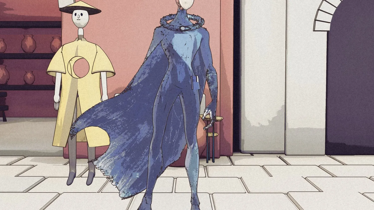
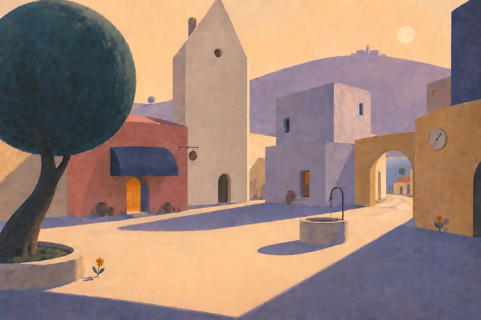
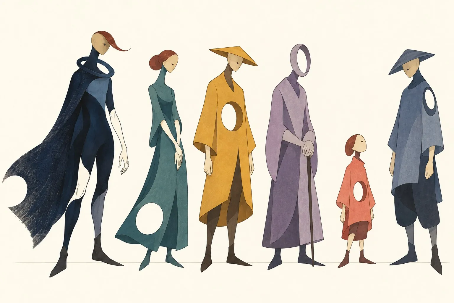
That sentence took most of a year to arrive at. The world is painted in gouache: ochre, coral, plaster, violet shadows, calm big shapes. The people are drawn, elongated, with masks for faces and one geometric void each. Kai is drawn in ink and is the only thing in red.
The references are Kaiba by Masaaki Yuasa, the towns of Final Fantasy IX, Sable, and Fantastic Planet by Laloux and Topor. The anti-references are just as important: anything that reads as toy bricks, anything chibi, anything that looks like a conventional anime clip.
The bake-off that locked it
On 20 October the same shop corner was rendered three ways and compared on one sheet. The third one won, and has been the rule since.
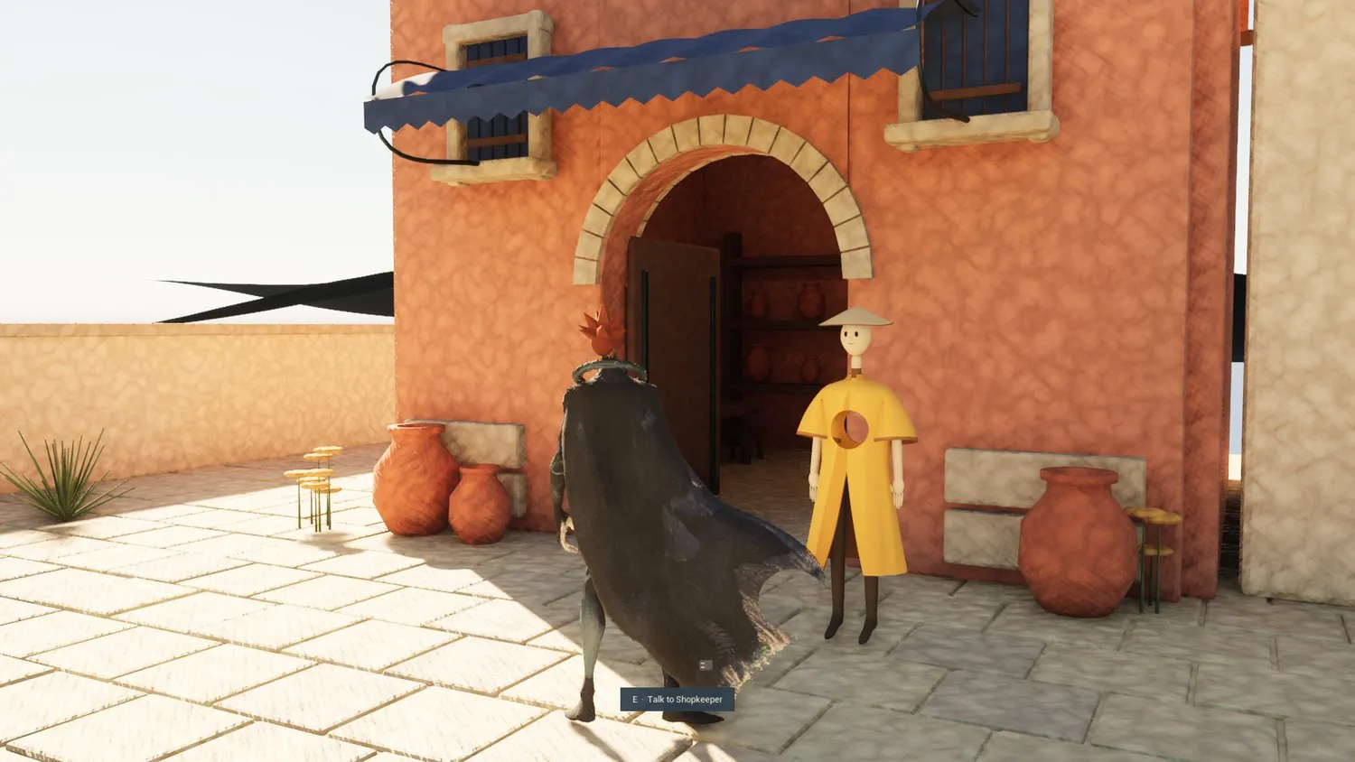
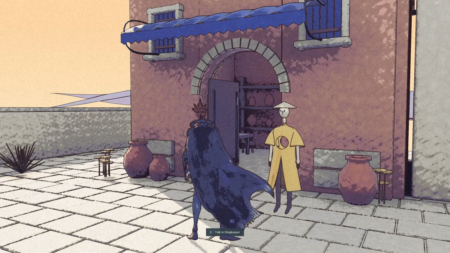
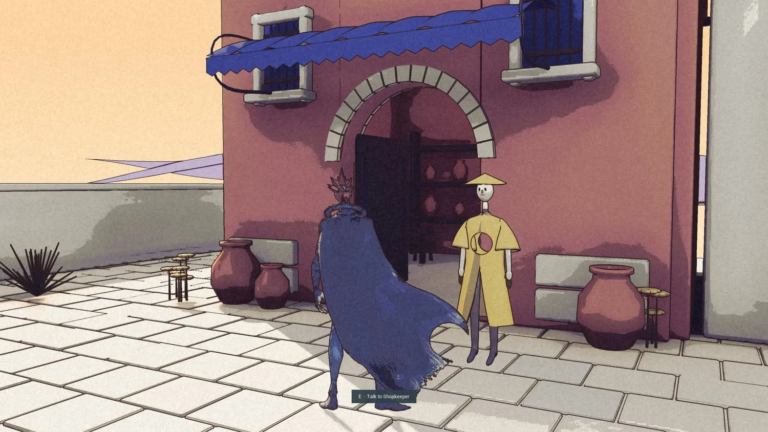
The rules
Written down as a contract so that any visual change can be checked against the day the look was accepted. In plain words:
- Ink lines
- Drawn in a post-process from steps in depth and creases in the surface normal. One pixel wide at 900 lines, scaling with resolution. Ink colour is a plum-black, not pure black.
- Five bands
- Light is snapped toward five value bands, a little over halfway, so surfaces read as painted planes rather than gradients.
- Lavender shadows
- Values below the middle are pushed toward lavender. The sun is late afternoon, warm, with a hard edge.
- Paper grain
- Two scales of screen-space grain, fine and coarse, laid over everything.
- A painted sky
- Beyond two kilometres the atmosphere is replaced with a gradient from peach to pale sand. Distance haze is lavender.
- Flat surfaces
- Each material is one flat colour multiplied by a greyscale pigment tile sampled in object space. No normal maps, no specular, no emissive. Roughness is one, except glass, iron and water.
- No global illumination
- Lumen is off. It cost frames and added nothing a painting would have.
The palette
Every surface in the town is one of these, times a pigment tile. The names are the material names in the build.
- Paving#E8C8A0
- Rose plaster#B8705E
- Blue plaster#A79AB0
- Ochre#C9A062
- Lime wash#D8C2A2
- Stone#CDB89A
- Ivory#E6D6B6
- Clay#B06C55
- Navy#3E4660
- Wood#4D4037
- Leaf#2E4248
- Leaf, light#4C6358
- Leaf, gold#7C8560
- Earth#6A5A48
- Mountain#A08CA6
- Iron#3A3C45
- Water#4F7F80
- Glass#C5A365
- Ink#2B1A1C
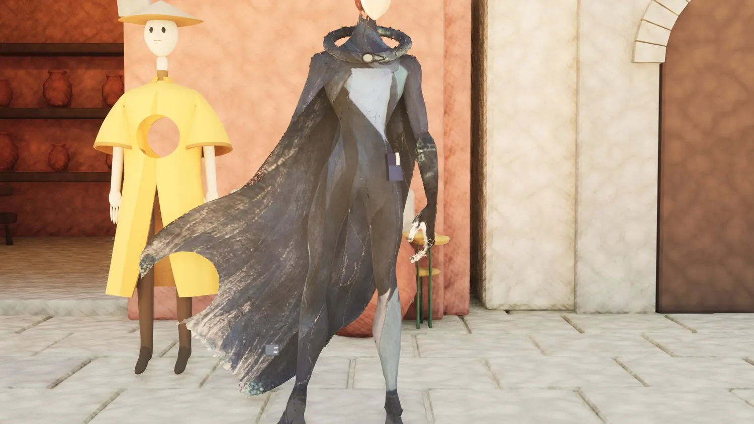
Kai, before and after
Kai keeps his own drawn texture; the look only adds the ink, the bands and the grain. The sleeve and the cape are the same mesh in both frames.
Painting first
Each place and each person starts on paper. The build is then checked against the painting from the same camera.
What was tried and set aside
- A scripted bevelled-box town in Godot. It read as toy bricks, in three palettes.
- A cartoon Kai and a chibi Kai. Wrong presence, wrong edge.
- Conventional anime video clips as reference for movement.
- Procedural townsfolk built from primitives with a skin modifier. However many tapers and hands they got, they looked like tubs put together. Replaced by drawn figures.
- A first version of Kai's phasing, where parts of him flickered to outline while he moved. It read as a glitch. The idea stays; the execution waits.
The lesson from all of it: the engine was never the block. Making the hero and the people was.